The Mobile next project
Started in 2018, the Chase mobile design team, product and tech were asked to come up with the next generation of mobile banking. The goal was to support & guide customers on their financial journey beyond just transactional interactions, and for Chase to deepen the relationship with the customers by providing a differentiated mobile experience that remains relevant to customer’s expectations.
My ROle
💡 Visual concept development, 👩🎨 Icon & pattern creation, 👩💻 Rapid prototyping
I am one of the key designers working with designers across different lines of business, my work include research, design, build prototypes, and deliver design artifacts. I collaborate with the brand team to ensure that Mobile Next’s visual elements and voice and tone are aligned with the brand identity, and work with the Design System team to build and enhance new design components.
goals
To give the Chase mobile a visual refresh.
Design should convey the brand’s core design principle: Simple, Human, Unified, and Informed.
Design should be simple and reduce cognitive load as products and feature evolve and expand at scale.
Partner with brand team and ensure our design elements are in alignment with the brand’s voice and tone.
deliverables
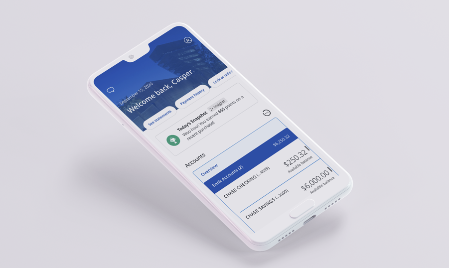
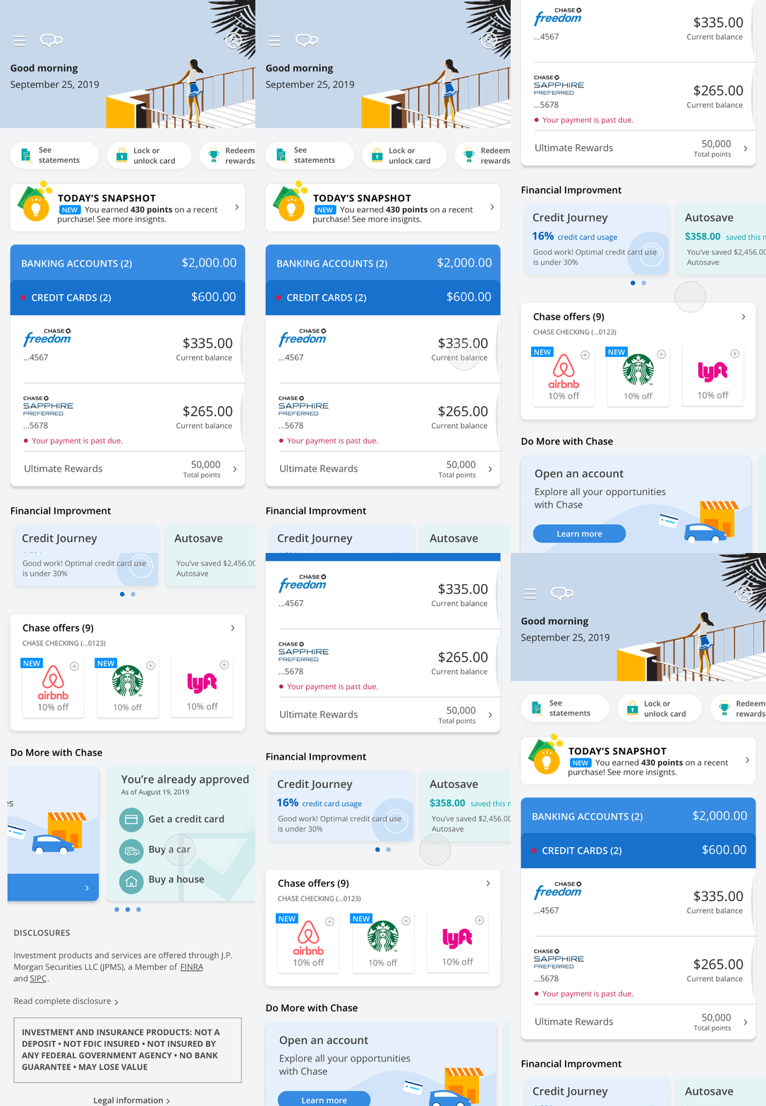
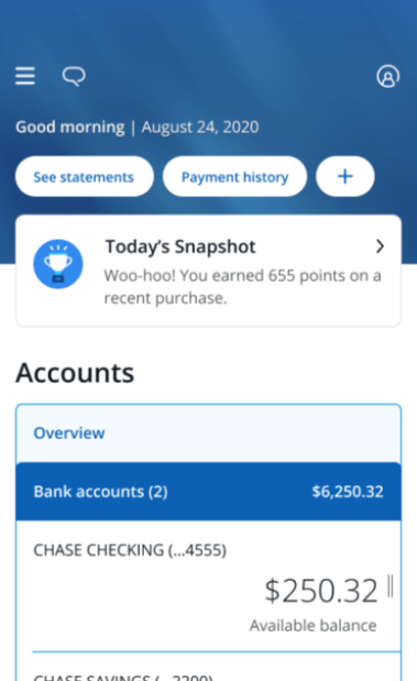
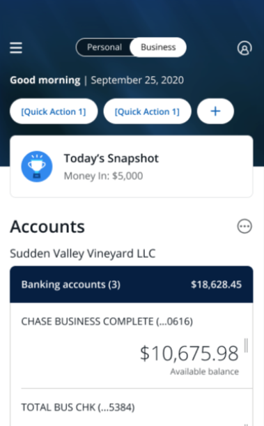
The three designs below show how the visual evolved in different phases. To validate in production, we introduced changes incrementally into existing app before rolling to all customers. The first employee pilot started in April 2020, and customer rollout begins in June, 2020 (starting with 5%). We closely monitor and address feedback as we continue to rollout to more customers.
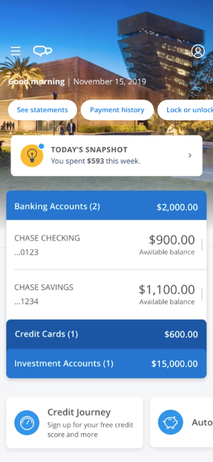
Employee pilot , April 2020
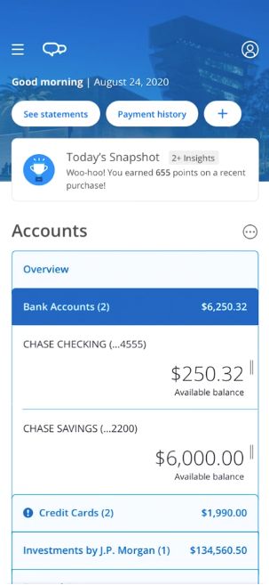
Customer pilot, July 2020
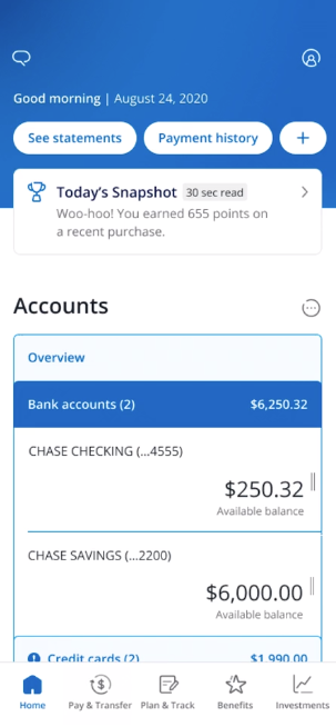
Customer pilot, June 2021
Design process -
Research and Explore
First we facilitated a design workshop for designers to gather inspirations and generate ideas. Designers shared examples from apps that evoke a particular style or concept that’s relevant to Chase. We brainstormed on what design elements ties into our four design principles: Informed, Human, Simple, and Unified and looked into current UI design trends and competitors references. The takeaway of this exercise was to learn about everyone’s thinking around design principles and gathered ideas into moodboards that could bring into visual design.
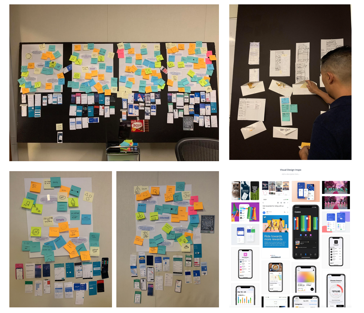
Early design explorations
“Think outside the box”
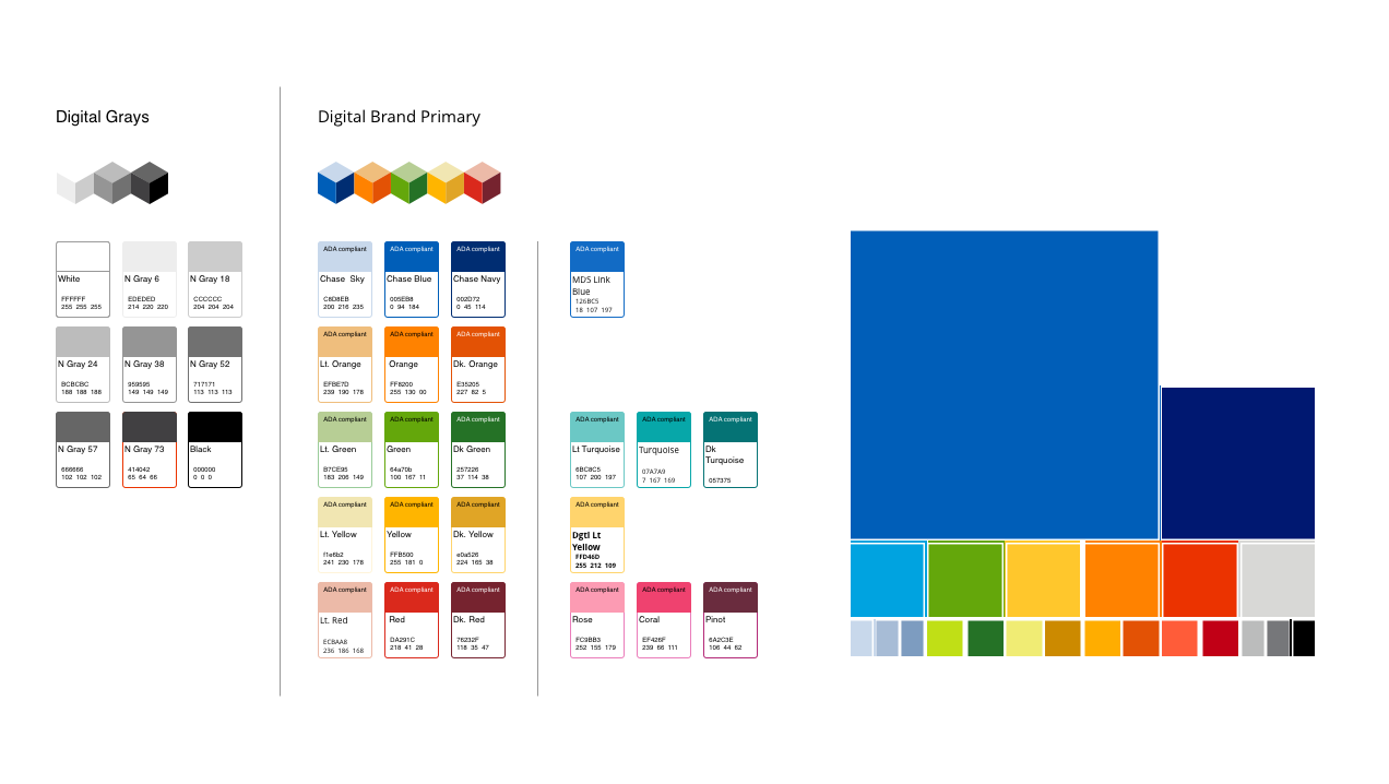
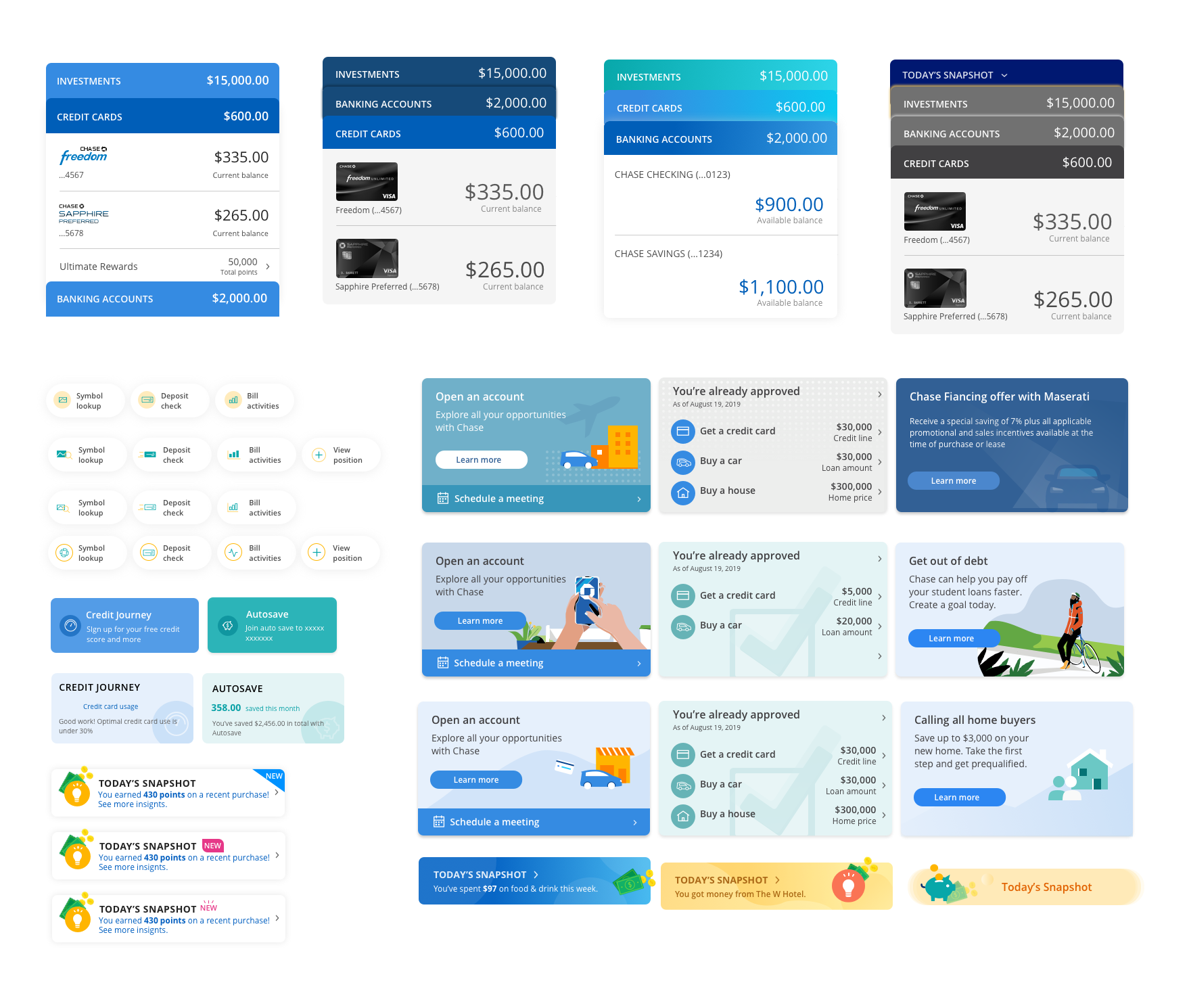
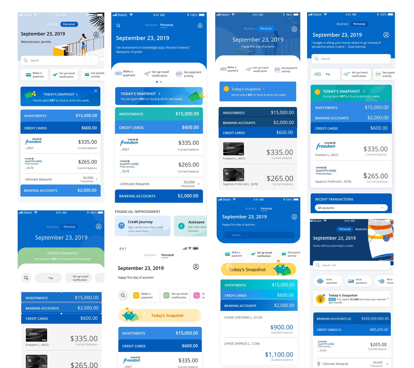
After many research on current trends, competitor analysis, I started sketching and exploring different color treatments, layouts, and components. I was told to think outside the box with no restrictions. The only constrain at the time was to incorporate the color from a color palette that the brand team was building on. I worked with them to test the digital color palette and incorporate the new color palette into the mobile UI.
First design and user testing
The first design direction was inspired by the data I received during research, I chose patterns that are commonly used in the modern fintech apps. I used gradients, soft colors, curves, rounded corners on tile to embody the current UI trend, and incorporated simple illustrations to create a fun and playful experience.
User Testing
Test the home experience through the lens of Visual
User feedback on cognitive load
Test all indicators (discoverability of CTAs, Carousels, etc.)
Key Takeaways
The majority of participants mentioned about the new design does not feel like a Chase app. They did not find connection between the new and current design.
“It looks nothing like the current Chase app.” -Joe, 38
The majority of participants preferred their accounts to be collapsed upon signing into their banking app. Many participants preferred this option as a solution to minimize the number of items already displayed on the screen (high cognitive load).
“I like the account windows closed because it feels a lot cleaner and simpler.” -Ella, 26
All participants were unable to find the swipe feature over each account (which allowed them to access Pay, Transfer, and Deposit).
“I like how this [swipe feature] tucks away these items, especially if I didn’t come to the banking app to use them...but I just didn’t realize that this was an option.” -Mike, 70
Next Steps
Consider exploration on design that are more Chase branded.
Consider simplifying visual elements/allowing all account windows to be closed.
Consider a different design visual cue for swipe CTA.
“Fallback” iterations
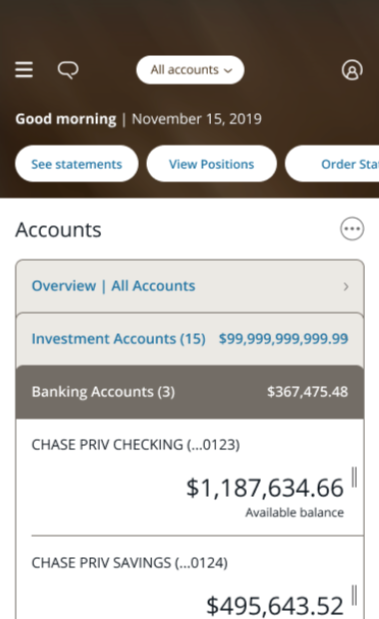
After presenting the first initial design concept to the stakeholders and senior leadership, I was told that the new design direction “doesn’t feel Chase”, “it is too playful”, and the tone of the design should be sophisticated, stable and secure. I then went back to sketching and iterating based on the direction I received. Another feedback i received is that the new design direction was too big of a jump to the current style. We realized that the new design need to evolve in a way that avoid disrupting the current user experience. Our solutions was to introduce changes incrementally into the current UI before rolling to all customers. I looked into existing patterns and components and apply the established design language to make the new designs sit well in the existing UI.
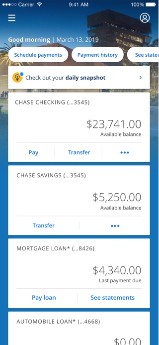
CURRENT APP
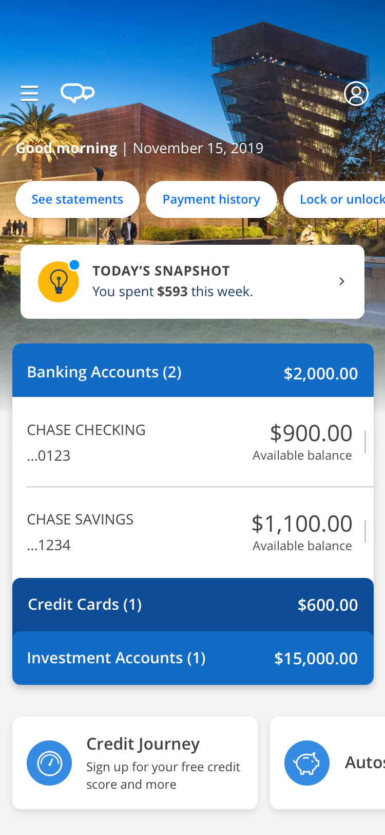
MOBILE NEXT
testing round 2
Visual Design: Gather feedback on the color and imagery of the home screen, and employ a variety of usability tasks to see if/how the visual aesthetics impacts the user experience.
Roll-up Balances: Understand if customers value displaying roll-up balances within their accounts.
Swipe-CTA: Test the discoverability of the contextual swipe-CTA within the accounts module.
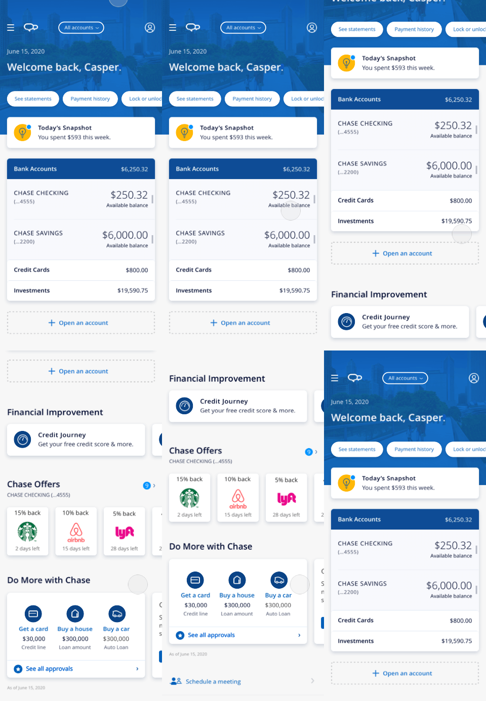
Visual Design
Overall, participants complimented the direction of Mobile Next’s visual design. The overall color scheme did not hinder anyone’s ability to navigate the app or accomplish tasks.
The design was commonly described as: Clear, Informative, Simple and Clean.
Participants perceived the design as strongly Chase-branded.
Usability Tasks
The ‘Open an account’ button lacked discoverability, and was assumed to be exclusive for Checking, Savings and Investment accounts.
Consistent with previous research, swipe CTA action had discoverability issues.
A/B test on Icon Color
Preferences were mixed for the color of the icons within the Financial Improvement section. The majority of participants suggested the icon color was not largely important to them, and did not affect their use of the app.
Next Steps
Consider quantitative testing for preferences of icon color for the features within Financial Improvement.
Continue qualitative testing for swipe-CTA action with design iterations or education inclusion.
Continue qualitative testing for entry for Open an Account.
Header patterns
Meanwhile, a business decision of removing the background photography from the header was made and I started to explore different design for the header space. Our team collaborated with Chase brand team on creative explorations and aligned on tone of the pattern. I explored from using illustrations, financial patterns and symbols, to using imagery with potential solid overlay. I had regular check-ins with directors and stakeholders and iterated design direction based on feedbacks.
City Illustrations
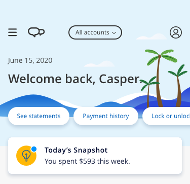
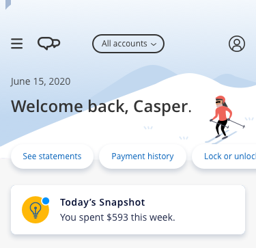
As we moved away from the regions photography background, I wanted to keep the “human” and “personalized” design elements from our Brand’s core design principles, therefore I proposed a direction of creating major cityscape illustration to replace the photography. The familiar visualizations could be built upon previous positive signals that’s received form the region photography. Also, they can be easily updated and cut time in the creative process.
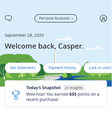
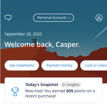
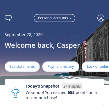
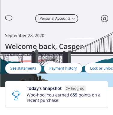
Personalized Illustration
Event/time-based illustrations and messages that changes based on season, sponsorship events, or holiday related, to express the personalized and human design principle.
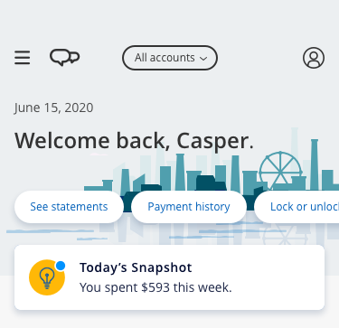
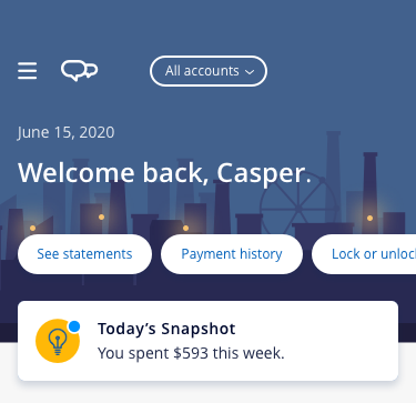
Metaphor Texture
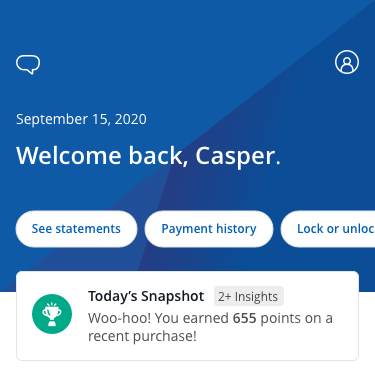
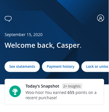
Explored various metaphors of patterns to convey strength and security, left to right from a honeycomb pattern, Chase logo, to complementary textures, this direction create visualization that embody a trusted environment.
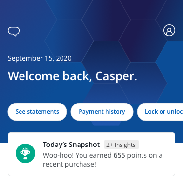
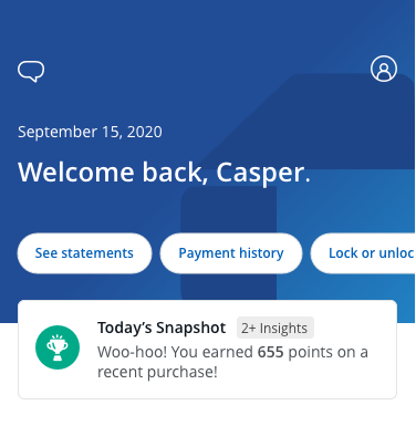
Final Direction - Bokeh Texture
A simple, Chase branded texture was chosen for the final direction, based on the feedback we received from the interview session, the style fulfill the visual goal we wanted to achieved: sophisticated, stable, and secure.
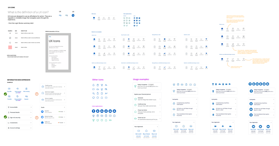
UX icons
I also played a key role on the creation of the new set of informative, non-expressive, and high functional UX icons. I contributed on exploring design concept, establishing direction, and delivering designs.
Old
Inconsistent in size, shape, weight, and style
Unclear representations of actions and products.
Inconsistent usage across channels.

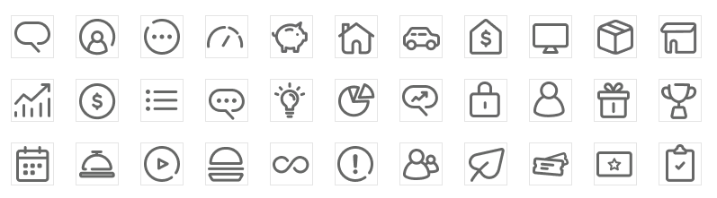
New
Built with grids and key lines in Illustrator to ensure size consistency.
Unify esthetics through common forms, shapes, and line weight to promote visual harmony.
Use easily recognizable objects to increase user identification & comprehension.
Final Design direction
Simplify design and remove unnecessary visual noise to reduce cognitive load.
Apply simple and Chase branded pattern and cohesive iconography set to achieve a branded house.
Meets accessibility standards on font size, color contrast ratios and CTA affordances.
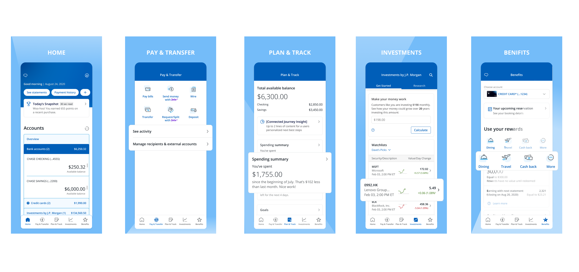
Results
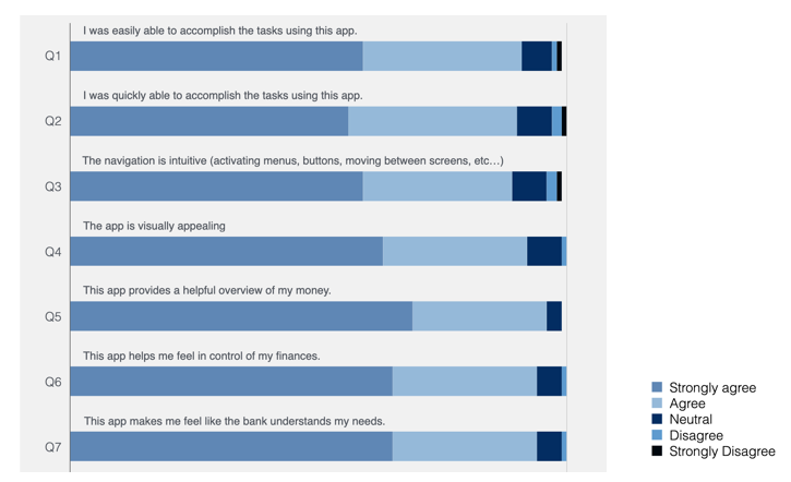
We conducted a holistic survey with 300 Chase mobile user through UserZoom, below is the summary of the findings.